
haptic
notes on accessibility

NOUN
The use of technology that stimulates the senses of touch and motion, especially to reproduce in remote operation or computer simulation the sensations that would be felt by a user interacting directly with physical objects.
The perception of objects by touch and proprioception, especially as involved in nonverbal communication.
ADJECTIVE
Relating to the sense of touch, in particular relating to the perception and manipulation of objects using the senses of touch and proprioception.
in college, i studied human-computer interaction, an interdisciplinary field spanning computer science, psychology, design, (and beyond) to explore and understand how humans interface with technology. in practice, much of my coursework involved exploratory studio classes where we’d 0-1 on a project within a given space — whether it be social networks, sustainability, education technology, etc. throughout the weeks, we iterated along the design thinking methodology to build something meaningful.
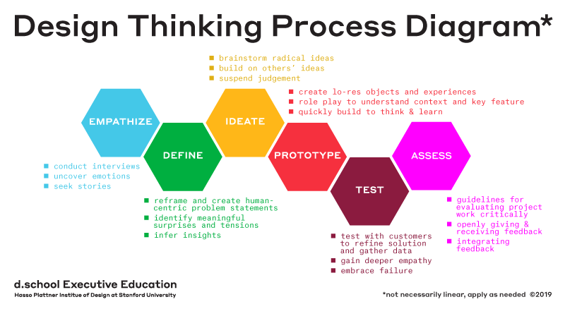
the phases of design thinking are to empathize, define, ideate, prototype, test, and assess. at the end of the day, you’re always thinking about the user and their perceived experience with whatever you build, whether it be digital or physical. beyond the design thinking methodology itself, there’s a few seemingly similar yet quite distinct principles that have arisen adjacently in approaching the how of design, or how to design.
universal design: “design that’s usable by all people, to the greatest extent possible, without the need for adaptation or specialized design” 1
equitable and flexible use, with tolerance for error and perceptible information.
examples include automatic doors or sidewalk ramps.
accessible design: design process in which the needs of people with disabilities are specifically considered.
often guided by legal requirements and standards
examples include the Americans with Disabilities Act (ADA), which mandated that public facilities and services be fully accessible to people with disabilities.
usable design: design that optimizes the “effectiveness, efficiency, and satisfaction with which a specified set of users can achieve a specified set of tasks in a particular environment.”
focus on components of learnability, efficiency, memorability, errors, satisfaction.
designing for usability does not explicitly include designing for accessibility.
executing within the constraints of our course requirements and 10-week quarters meant some elements of design were overlooked, namely accessible design. though we iterated through increasingly higher-fidelity prototypes, from wireframe sketches to figma to building out ui, the extent of our usability studies and heuristic evaluations never strayed into the realm of explicitly designing for accessibility, and i remained unaware of the nuances of the space until later.
disability is more prevalent (and oft-unnoticed) than most realize, extending far beyond what we perceive in our day to day. 1 in 4 adults in the United States lives with a disability, from short term situational impairments to long term permanent disabilities. some medical professionals categorize disabilities along the axes of physical (which affect a person’s body), intellectual (which affect a person’s thinking or learning), developmental (which arise during childhood or adolescence), congenital (which exist from birth), and invisible (which aren’t perceptible to others).
a disability is any condition of the body or mind (impairment) that makes it more difficult for the person with the condition to do certain activities and interact with the world around them. (source, CDC)
broadly, accessibility is when the needs of people with disabilities are specifically considered, and products, services, and facilities are built or modified so that they can be used by people of all abilities.
one historic piece of legislation that broadly addressed the severe lack of accessibility in society was the Americans with Disabilities Act (ADA), signed into law by President Bush in 1990 after decades of advocacy. it was later amended in 2008 to extend its protections to more people. the law provides a broad array of civil rights protections for people with disabilities, including prohibitions against employment discrimination and mandates to make public accommodations accessible.
while ADA regulation improved the status quo, it alone is still insufficient to address the burgeoning needs and gaps in society today. not everything considered accessible through ADA compliance actually meets the needs of affected populations in practice, or provides an equivalently meaningful experience for all users. take playgrounds, for example — any playground built after 2012 must meet the following criteria to be considered accessible:
an accessible path from the building or parking lot to the edge of the play area.
an accessible path from the edge of the play area to the play equipment.
surfacing that complies with ASTM 1951 (Determination of Accessibility of Surface Systems Under and Around Playground Equipment).
once a child is in the play area, they must be able to access the play equipment by either moving out of their mobility device onto the playground structure (such as a transfer station) or by direct play structure access in their mobility device (such as a ramp).

the playground shown above is considered ADA compliant because it technically does meet all of the requirements — there is a ramp that leads in from the parking lot and a child in a mobility device such as a wheelchair can wheel onto the play structure and…that’s just about it. there’s no other engaging interactions other than accessing the structure. or alternatively, imagine a child who has sensory sensitivity, which is commonly experienced by those with autism or ADHD. there’s only one main ‘play route’ here in the structure, making it easy for them to be caught and overstimulated with no ‘retreats’ if there's many children at play in such a densely packed space. these are only two examples of how this playground may be considered ‘accessible’ on paper, but is by no means exhaustive of all its potential shortcomings.

on the contrary, the playground shown above was designed to be inclusive to all audiences, attracting visitors of all ages and all abilities. this playground is one of several designed by the Magical Bridge foundation, which originated in Palo Alto. the playgrounds are intentionally divided into distinct zones because predictability is important for many visitors. each zone represents a type of movement, such as spinning, swinging, or sliding, or a play style, such as imagination or music. while clearly designated by zone markers (often including Braille and raised tactile maps) and with changes in ground color, the zones are seamlessly integrated and connected, allowing ample space for free movement between the areas.
as an example, the spinning zone promotes rotary vestibular input, which is often used by occupational therapists in sensory integration therapy. caused by spinning, it is the most powerful form of sensory input that the brain can process. in the picture above, the spinning zone is the light green zone in the center, containing various spinning structures that accommodate a wide variety of users; the carousel on the right fits two wheelchairs and the spaced spinners allow spinning in various positions.
the Magical Bridge foundation began as one mother’s desire to have a safe and inviting and exciting space for both her children, who had very different needs, to play. there are now several Magical Bridge playgrounds throughout the Bay area and several in the works worldwide. on paper, both playgrounds shown comply to the same set of criteria, but the end result is starkly different. these playgrounds are a testament to the difference between building something to simply comply to mandates, and thoughtfully building something with the experience of all end users at the forefront. it begins with care, with empathy, with a single story of someones’ lived experience and dreams made reality. it’s a paradigm shift to look to lived realities beyond ones’ own. to care matters. to do something with that care is magical.
overwhelmingly, i have tried to live guided by empathy, through the lens of sharing and pursuing stories of lived experiences beyond my own. part of it stems from my own experience growing up and living with mental disorders, as well as learning to listen first (and listen keenly) throughout my time working on a crisis hotline. part of it has arisen from trying to find purpose in my life through the intersection of things i care about and the skills i have.
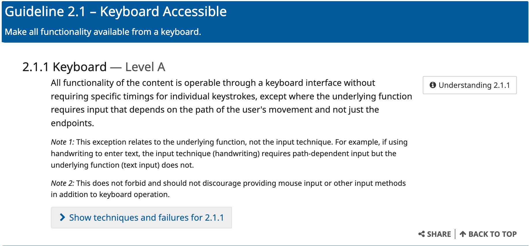
digital accessibility is most immediately prevalent in my line of work. as a product engineer, it is my (and the company’s) responsibility to ensure that the digital products i create are usable by all users, not just the majority. historically, there has not been strictly enforced regulation around the accessibility of digital products and technologies, but initiatives and organizations have spun out over the years towards this aim. in 1994, sir Tim Berners-Lee founded the World Wide Web Consortium (W3C) at MIT in collaboration with CERN, and in fall 1996, the Web Accessibility Initiative (WAI) was first conceived as a W3C project. they put forth the Web Content Accessibility Guidelines (WCAG), an international standard that documents how to make web content accessible. throughout the years, they’ve made subsequent releases of WCAG 2.0, 2.1, and 2.2, and a working draft of WCAG3 was published in summer 2023, with intentions to be finalized as W3C standard in a few years. WCAG 2 outlines 13 guidelines under the overarching principles of perceivable, operable, understandable, and robust, and the success criteria to conform to each.
however, the WCAG was originally written with web interfaces in mind, whereas mobile interfaces have come to be increasingly predominant in our lives. in designing accessible digital interfaces, the most prevalent targets are ensuring the technology interfaces well with screen readers, is high contrast, and has reasonable interactions for low-vision and motor-impaired users. adapting to an increasingly mobile landscape is a burgeoning problem. for example, a screen reader built for a computer can be controlled by pressing different keyboard buttons, allowing for fine-grained control, and also websites generally, have a more standard hierarchy of design (such as having a top bar of buttons, or resources/contact at the bottom of the page, or profile/login at the top right corner, etc). html is inherently structured by hierarchy with discretely defined levels of headings, whereas no such concrete paradigm exists for mobile apps. mobile interfaces are more structurally diverse in layout and interaction — everything mobile is inherently touch-based, with unique gestures such as long pressing or double tapping or dragging and swiping, and much more varied visual hierarchies and application design. this requires a fundamental rethinking of how certain interactions can be translated programmatically for different audiences to still meaningfully engage with. (and begs the question of standardization as well, or how to build towards universal, usable design that is easily understood and engaging for all users).
i work in React Native for frontend code. React Native is built on top of native Android and native iOS, such that the code i write in React Native is translated into something meaningful for each native platform to interpret and render accordingly. the same cycle exists for native platform screen readers — whatever code i write in React Native that is meant to support accessibility functionality will be interpreted differently by Android’s own screen reader, TalkBack, and iOS’s screen reader, VoiceOver. however, in many ways, these screen readers are configured differently as well, such as in how they handle nested structures. therefore, a piece of code written in React Native may be interpreted differently by both platforms, requiring in-code workarounds to ensure both tools behave as expected. (this is why, if you read React Native’s accessibility documentation, there are some props that are platform-specific). React Native accessibility actions are also interpretable by switch-control and other assistive technologies.
mobile screen readers are setup to translate physical gestures and verbal commands to actions on the screen. they start by ‘focusing’ on an element (visually, it will be highlighted). the focused element has an accessibility label and role read out, and if it is a text element such as a heading, it will also be read out. if it’s an image with alt text, that alt text will be read out. if it’s an interactive element, such as a button or switch, that role and state will be announced. to press a button, the workflow is usually to double tap. users can also give verbal commands that will be translated to an action — such as saying ‘press button’. the app should be laid out in a way where the hierarchy (reading left-right, top-bottom) is interpretable by the screen reader, allowing users to pan through element by element or swipe through as well. each of these conditions achieved by configuring props in React Native.
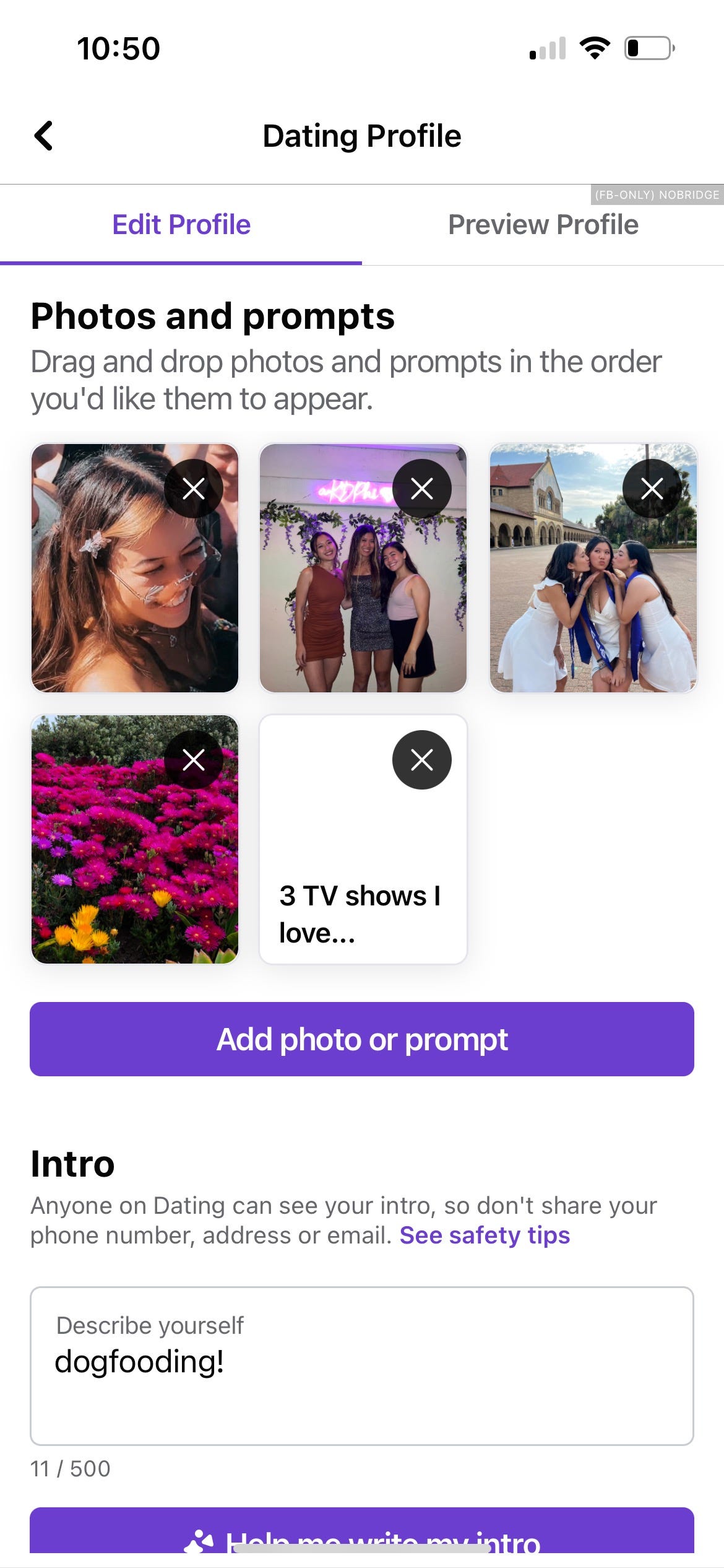
adding an accessibilityLabel to a new element may be straightforward, but often, there’s core interactions that are more difficult to translate, such as swiping on a profile, or reordering your photos. in the ‘edit profile’ screen of our app, we have a series of photo and prompt cards that are displayed that you can rearrange and reorder, with overlaid ‘x’ buttons on each card to remove a certain photo or card. the nominal way to do so is to long press the photo and drag it to a different place within the container. however, there are no translatable actions in a screen reader that can chain the series of long-press, swipe/drag. because of the draggable sort container that we use, the VoiceOver is unable to interpret the overlaid elements and is unable to focus on the close button — the onPress() handlers of each card executes the reordering logic for when it’s moved and those handlers overshadow focus priority. they prevent any descendants underneath from being focused, which makes it impossible to use alternate gestures to reorder the photos. however, TalkBack is able to interpret these overlaid hierarchies and is able to successfully focus on the ‘x’ button separately from the photo.
a possible workaround is to use a combination of a few different props in react native. there’s a prop isScreenReaderEnabled() that returns a boolean for whether or not a native screen reader or third-party accessibility service is currently active. so, to address the onPress() handlers, there would first be a layer of conditional logic that disables the onPress handlers if isScreenReaderEnabled() is true, in order for any accessibility-related functionality to focus and register. there is also a paradigm called Accessibility Actions, which allow you to specify a user-defined set of actions when accessibility is enabled. for example, instead of emulating the long press + drag with physical gestures, we can do something like, highlight focus element on a certain command and ‘increment’ the card with another simple gesture, like a tap (or a predefined screen reader gesture, or a button press on a switch control), and in code, this ‘increment’ will translate to moving the image up one, or moving it in front of the preceding image.
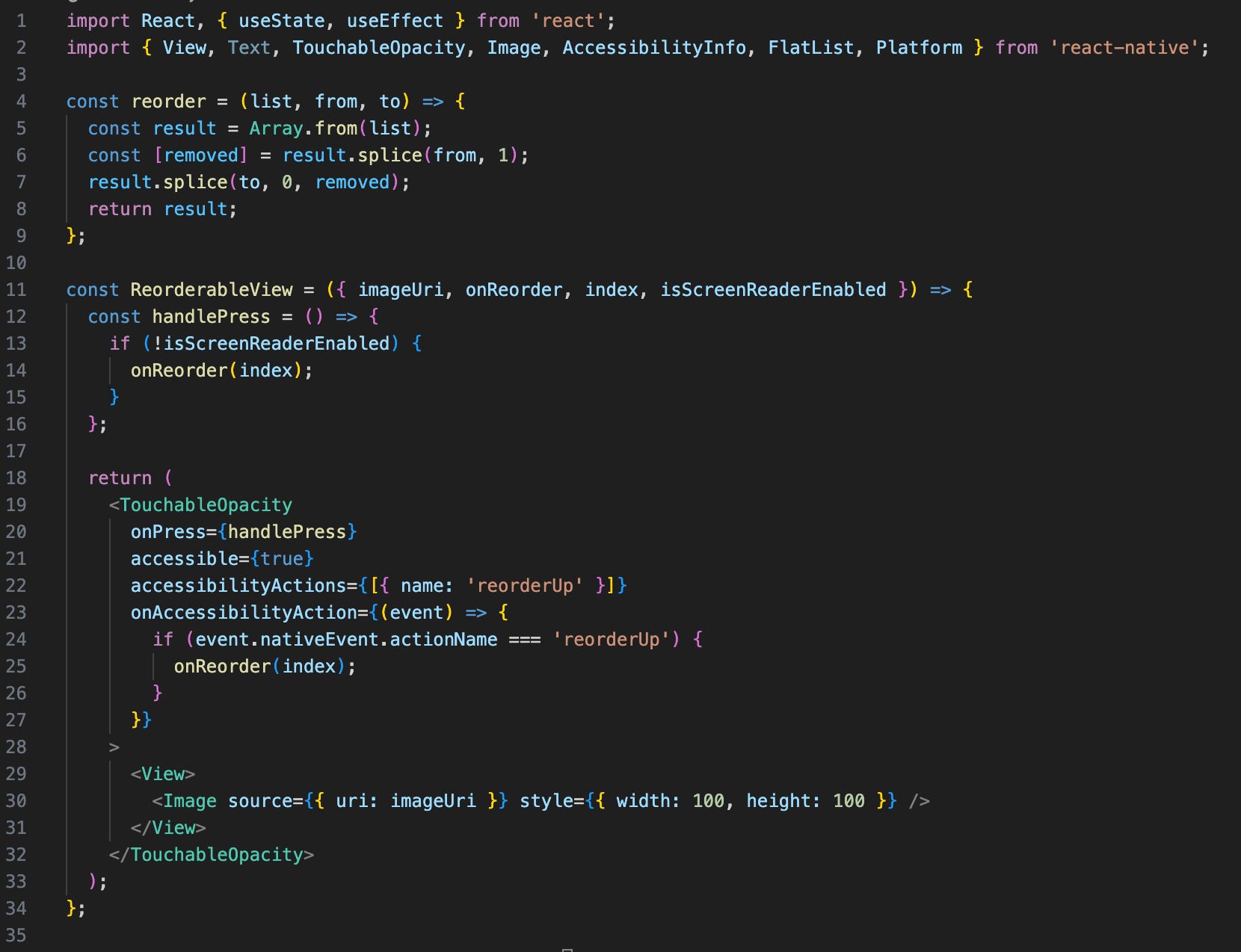
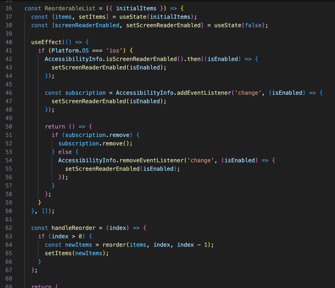
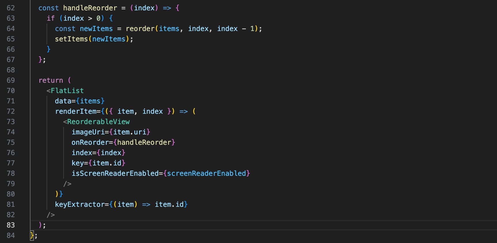
here’s a stubbed-out example snippet of how that might look — note the platform-specific check for whether or not a screen reader is active, and how the onPress is disabled when it isn’t, and the function written to handle a custom-defined accessibilityAction that achieves the same functionality as a drag-and-drop reordering.
accessibility functionality wasn’t explicitly enforced at work until recently. the EU recently passed legislation that has been adopted into law by the majority of its member states, mandating that products and services must be made accessible by a set of certain standards by 2025. the European Accessibility Act identifies the product features and service features that must be accessible for people with disabilities and enforces compliance checks and regulation. to that aim, facebook’s application suite must now be overhauled to comply to these standards, ensuring our products are meaningfully usable for all users. each team is responsible for ensuring that their product is accessible. in working on dating, i’m uniquely able to tackle accessibility issues across the entire dating platform (as opposed to teams that only work on a select cross-platform feature, like ads).
however, despite this impending deadline, efforts to push for a completely accessible application are often overshadowed by more ‘exciting’ project work, and accessibility work is often regarded with the same treatment as bug fixes and maintenance and upkeep work. when i first joined the team, i’d started looking into accessibility work to familiarize myself across our codebase, but quickly realized how lacking voluntary sentiment towards addressing it was, as well as pain points in developing, throughout handling abstraction across react native and platform-specific screen readers. again, as a product engineer, the most i’m able to do at work is ensure the products that we put out into the world are accessible, but it’s an entirely different problem altogether to tackle the persistent lack of tooling and the disparity of standards across different companies and platforms as well. i hope that over time, more people will realize the importance of designing and building thoughtfully across all levels of development and approach the work to be done in this space as more than just boxes on a checklist. rather, the ethos should be that this is our fundamental responsibility as thinkers and designers and technologists and builders and makers: to create for good, and for all.
i’m grateful to be able to work in this space, albeit a limited slice, alongside the usual eng work i do. i’ve been thinking about what more i can do in my own life — learning how to better implement our product experiences accessibly at work is definitely top-of-mind, and i’m aiming to continue compiling my learnings there. i thought about looking more into accessibility teams at work or the efforts that the react native team itself is driving — infrastructural-level impact in the accessibility realm that feeds into better tooling that every product engineer can (and should) use. i thought about looking beyond simply the engineering aspect as well, bridging into the initial design phase, where the vision for our interfaces even come to be. i thought about the things i could try to do in my day to day as i continue to learn what’s lacking in this vast field, and what i can do to disperse that sentiment more broadly.
at the end of the day, much of it comes down to care and exposure. there’s so much for me to learn too, in trying to live by my own principles. i think about how to spread empathy, how to share that care, to inspire others to observe a little more keenly and think a little more thoughtfully and perceive worlds beyond their own. :)
note: there is so much for me to learn too, and everything i’ve written about is by no means comprehensive. i simply wanted to share what i have learned and been exposed to thus far, and i’m actively trying to learn more and find what i can do as well! in addition to work-related goals and learnings, i’m working on making my own portfolio accessibly + trying to learn ASL + engage more with community initiatives.
for anyone interested in diving deeper on the tech side, here’s some resources i’ve used and assistive technologies i’ve worked with! on top of these, i would definitely recommend trying out whatever screen reader is native to your phone. if you’re not involved in tech at all, there’s plenty of little things that you can do too! add alt text to every photo you post, look to learning asl, see what people in your community are doing and need, and more.
i use this at work all the time when i’m doing accessibility-related tasks! Xcode has a standalone developer tool that pulls up a window that allows you to see how content may be represented and interpreted by a screen reader, and helps with checking if certain interactions or focus states are translated correctly.
this still works differently than what screen readers actually interpret and understand, so it’s great as a preliminary step, but you should always test on-device as well with the native screen reader to ensure things work as expected.
React Native has done well at trying to keep up with supporting accessibility tooling despite constraints from a web-based philosophy and also integrating with native platforms as well. This documents all the current tooling they support.
this tool evaluates web site content and identifies accessibility and WCAG errors. it highlights issues that impact users and is really helpful for gaining familiarity with the kinds of common pitfalls and gaps that exist.
this chrome extension simulates how people with a certain set of disabilities may experience the web. as a one-off simulation, it is by no means a comprehensive representation of the lived experience of one of these disabilities, but instead seeks to offer a glimpse of understanding at how others may interact with the web, and can also help with testing certain interactions and perceptions.
Stark is an ‘all-in-one’ platform with a variety of free and paid accessibility tooling, including a contrast checker, focus order tool, etc.
apple has a really great design philosophy surrounding accessibility and has taken care to focus on making accessible products. take a read at the work they’ve done and are doing!
more interesting reads:
more on ronald mace
a11y → accessibility (11 letters in between a and y), the a11y project
https://www.nytimes.com/1998/07/13/us/ronald-l-mace-58-designer-of-buildings-accessible-to-all.html